QMU Brand Guidelines v15
Our corporate identity is a vital part of QMU’s visual presence. Used consistently and correctly, it helps convey our professionalism and build trust in the University. These guidelines provide you with the information that you will need to use our corporate identity correctly.
Introduction | Logo | Photography | Correspondence | Promotional Materials
You can download artwork for our logos.
There should be no need to create any additional modified artwork – if you feel you have a requirement which has not been provided for, please contact the Marketing and Communication Office (Tel: +44 (0)131 474 0000 or email: marketing@qmu.ac.uk).
If you are a member of staff and have any queries or would like to discuss any part of the corporate identity, please contact the Marketing and Communication Office.
Any third parties wishing to use any part of the corporate identity should seek relevant permission from the Marketing and Communication Office.
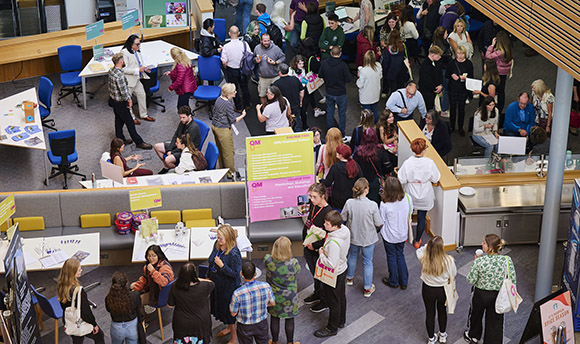
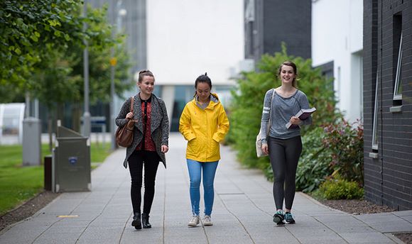
Our brand is, of course, much broader than our logo. Our corporate identity stems not only from our logo, but from our approach to photography, tone of voice and everything associated with ‘how we do things around here’ including how we interact with students, other stakeholders and colleagues.
You might also find our guidance on tone of voice useful. This is available on the Marketing section of the QMU intranet site.
Queen Margaret University: Purpose and Values
Our purpose
We see our purpose as helping to create a better society through education, research and innovation, and by providing a supportive and creative learning environment in which students and staff thrive. In seeking to fulfil this purpose, we are clear and realistic about our strengths, focused on strategic goals, persistent in pursuing opportunities and overcoming barriers, and guided by our values.
Our values
We are a university that is modern in our outlook and facilities but with a maturity built on a long history of serving the community, both locally and globally, and enhancing its wellbeing. We work in a transparent and inclusive manner and hold to core values in everything we do.
We value environmental sustainability: We recognise the severe threats to our environment and will be a sector leader in response. Our modern campus is a great asset in this work.
We value the individual and encourage collective support: Each member of staff and each student has their own journey to make and their own contribution to give. Queen Margaret University provides the supportive environment to facilitate this.
We value intellectual curiosity and the journey of discovery: We design our teaching and research to facilitate this.
We value ambition: We inspire our students and staff to achieve the best that they can. We pursue opportunities, often in partnership and collaboration with others, to transform and influence society for the better and enhance our visibility within the higher education sector and the wider economy.
We value excellence: This is embedded in our research, teaching and learning, knowledge exchange and the services we provide. It will be exemplified in the experience of our students, staff and partners.
We value social justice: In fact, it underpins our world view. We embrace equality, diversity, inclusion, respect, and supporting our communities. Opportunities and access are open to all and on a fair basis.
Principles Underpinning the Design and Colour Palette
The following principles underpin the design and colour palette used in our corporate identity:
• We aim to avoid garish or primary colours, whilst remaining vibrant.
• We will use rich colours and tones that link to our branding – our palette is made up of a mix of warm and cooler tones.
• We will use grey as a mixer colour – with grey, blue and teal as main colours, and with further blends of purple and blue, and other complementary colours. For specifications of our core colours.
• We will have a suitable array of colour pantones to allow the flexibility to select accent colours according to the image.
• We will ensure a certain amount of white space in design and photography
• On our website, we will apply a standardised colour throughout, with accent colours chosen according to the image used.
• We will aim for design to be bright and engaging.
• We will reflect differences in postgraduate and undergraduate study through style of imagery and colours, whilst retaining similar tones.
• We will ensure that colours complement not compete.
• We will ensure all photographs have a clear definition of subject, by use of a selective focus.
• We will employ bold use of colour but not bold colours!
Our approach to photographic style depends on the purpose of the photography.
Logo Marque | Logo for Small Spaces | Colour | Types & Fonts | Sub-Brands | Website
Logo Marque
Ensuring Correct Format
The logotype format should never be modified. Always use the artwork supplied. If you have a specific requirement which cannot be met by any of the supplied artwork, please contact the Marketing and Communications Office.
Elements
The Queen Margaret University logo is constructed from several visual elements (see images below). These elements should only be used individually by the University’s Marketing and Communications Office.
Minimum Size
Due to the complexity of the crest, minimum sizes for reproduction have been set. The minimum size of the logotype is 15mm, measured as shown below left.
The namestyle has been specially sized and spaced and should not be altered in any way.
It is important only to use the logo in contexts where it is clearly legible. In other words, make sure that the logo is not too small to be read in the context it is being used.
Ensuring Correct Format
The logotype format should never be modified. Do not change proportions of elements used.
The social media button is the only instance in which the crest can be used alone.
Exclusion Zones
The logo should not be suffocated by other elements on a page. Try to keep the logo clear of clutter on the page. We suggest an exclusion zone of the shield size.
Correct Background
The logotype must always be clear and visible. The background on which the logotype is displayed can enhance or detract from the identity. Always select a simple, uncluttered background. Where the background is strong or dark, please use the appropriate reversed logotype.
EnsuringLinear Logo Variations and Usage
We have transitioned to a mono version for use on coloured backgrounds. For coloured backgrounds, the use of a white logo is usable if the background colour is dark enough to provide sufficient contrast.
Stacked Logo Variations and Usage
As with the linear logo, there is a white keyline version for use over colour.
Logo for Small Spaces
ONLY USE IN SITUATIONS WHERE LEGIBILITY IS PARAMOUNT.
(For example, when the logo will be used small or when being viewed at a distance.)
Incorrect Format
When using the stacked logo where the shield element is 14mm wide, an alternative (condensed stack logo) version of the logo may be used where the University name is more prominent.
Condensed Stacked Logo
The Queen Margaret University logo was developed to allow the legible reproduction of the logo for use in small adverts or when viewed at a distance. This is a suitable logo for printing and digital reproduction only when the other logo will not reproduce efficiently.
Alternative Reversed Logo
Logo for use over coloured backgrounds.
Web Suitable Logo
Web suitable logos are available to use online on request to the Graphic Designer.
Colour
Colours
The blue, silver and black colours set out here are integral parts of the QMU identity and should be used wherever possible. Colours for coated and uncoated paper have been specially selected for accurate reproduction.
Optimum reproduction is achieved using the three spot colour version of the logotype – this should be used wherever possible. Process, single colour and line versions have also been drawn to suit all printing requirements when spot colours are unavailable or impractical.
RGB
RGB is the logo to use for websites, videos or screens.
SPOT COLOUR
Two colour logo uses the Pantone colour matching system. This is only used in two colour litho printing.
CMYK / PROCESS
CMYK is the logo for four colour litho printing.