
Logo Guidelines
Logo marque
Ensuring correct format
The logotype format should never be modified. Always use the artwork supplied. If you have a specific requirement which cannot be met by any of the supplied artwork, please contact the Marketing and Communications Office.
The namestyle has been specially sized and spaced and should not be altered in any way.
Linear logo

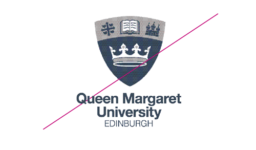
The Queen Margaret University logo. This is the preferred logo for printing and digital reproduction.
Linear logo - download EPS (.zip)
Linear logo - download PNG (.zip)
Linear logo condensed

For use in certain situations where space is restricted condensed version of the Linear logo has been created.
Linear logo (condensed) - download EPS (.zip)
Linear logo (condensed) - download PNG (.zip)
Stacked logo

For use in certain situations where space is restricted, a stacked version of the logotype has been created.
Stacked logo - download PNG (.zip)
Stacked logo - download EPS (.zip)
Elements
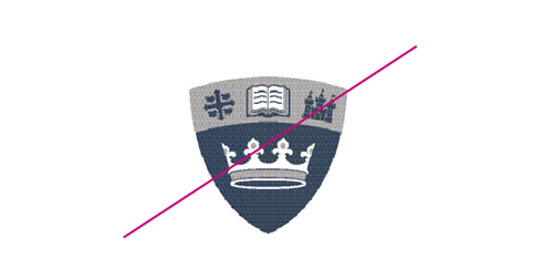
The Queen Margaret University logo is constructed from several visual elements (see images below). These elements should only be used individually by the University’s Marketing and Communications Office.
| Logo | Info |
|---|---|
 |
The Crown symbolises Queen Margaret |
 |
Martlets and Cross
The martlet is a mythological bird used in heraldry and associated with learning. It is footless, symbolising its constant flight in search of knowledge. The cross represents the canonisation of Queen Margaret. |
 |
Book represents knowledge |
 |
Castle represents Edinburgh |
Minimum size
Due to the complexity of the crest, minimum sizes for reproduction have been set. The minimum size of the logotype is 15mm. It is important only to use the logo in contexts where it is clearly legible. In other words, make sure that the logo is not too small to be read in the context it is being used.
Ensuring correct format
The logotype format should never be modified. Do not change the proportions of elements used. Do not isolate the shield from the text.
Exclusion Zones
The logo should not be suffocated by other elements on a page. Try to keep the logo clear of clutter on the page. We suggest an exclusion zone of the shield size.
![]()
Ensuring correct background
The logotype must always be clear and visible. The background on which the logotype is displayed can enhance or detract from the identity. Always select a simple, uncluttered background. Where the background is strong or dark, please use the appropriate reversed logotype.
Stacked logo variations and usage
We have transitioned to a mono version for use on coloured backgrounds. For coloured backgrounds, the use of a white logo is usable if the background colour is dark enough to provide sufficient contrast.
| Correct Logo | Incorrect Logo |
|---|---|
 |
 |
| Contrast correct | Too light - not enough contrast |
Linear logo
We have transitioned to a mono version for use on coloured backgrounds. For coloured backgrounds, the use of a white logo is usable if the background colour is dark enough to provide sufficient contrast.
OK:

Too light - not enough contrast:

Logo for small spaces
When using the stacked logo where the shield element is 14mm wide, an alternative (condensed stacked logo) version of the logo may be used where the university name is more prominent. Only use in situations where legibility is paramount (for example, when the logo will be used small or when being viewed at a distance).
Condensed stacked logo
The Queen Margaret University logo was developed to allow the legible reproduction of the logo for use in small adverts or when viewed at a distance. This is a suitable logo for printing and digital reproduction only when the other logos will not reproduce efficiently.
![]()
Condensed stacked logo - download PNG (.zip)
Condensed stacked logo - download EPS (.zip)
|
Reversed condensed logo Logo for use over coloured backgrounds |
|---|
Sub-brands
To ensure the strength of the corporate brand, the University only employs a very limited number of sub-brands.
Do not create your own sub-brand or attempt to form a proxy sub-brand by placing wording about your constituent part of the University adjacent to the logo. If you think you need a sub-brand, please speak with the Marketing and Communications office. All sub-brands need to be approved by the University’s Senior Leadership Team.
Our standard sub-brand logo uses a separator to distinguish the sub-brand from the in-line logo.
Sample sub-brands

Inline Sub-brands - download .Zip
Website

Logo usage online
For our website, we have simplified our logo to appear reversed out on a coloured background, reflecting modern web design. The logo appears on the top left corner of the website, on dark blue. Generally, the logo can appear reversed out of a background with a solid background. If it is to appear over white, please use the full colour stacked or in-line logo.
![]()


